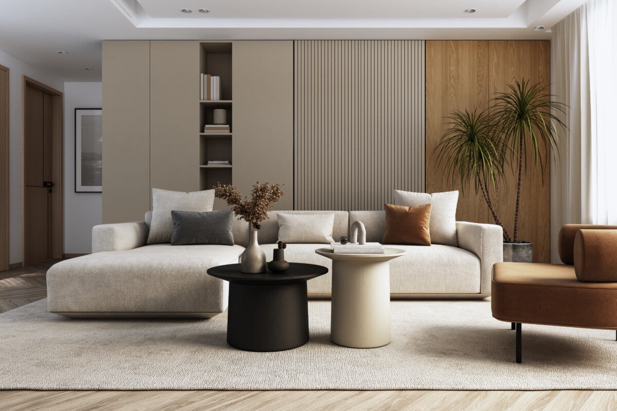
Creams, beiges, and taupes, often overlooked in favor of more vibrant colors, are again making a resurgence in the world of home decor. These neutral shades bring a sense of calmness, warmth, and versatility to living spaces. Whether you’re designing your new house in San Marcos, CA, or Oklahoma City, this is a good style because it effortlessly complements the serene and diverse landscapes of both regions, providing a timeless backdrop for your home that harmonizes with the natural beauty of coastal California or the heartland of Oklahoma.
This Redfin article explores the renewed popularity of these understated hues, offering insights from interior design experts on how to use them effectively in your home. From creating texture to incorporating pops of color and adding personal touches, discover the secrets to making these neutral tones the foundation of your stylish and inviting living spaces.
1. Beige decor isn’t boring
“Beige does not have to mean boring,” says Stegall Studios. “Using neutral tones like taupe, cream and beige can create an immediate sense of calmness and tranquility. The key to getting it right and making it interesting is incorporating different textures and patterns into this color palette.
The creamy colored room below was in need of a boost, so we added a 3-dimensional porcelain tile to the fireplace. We kept it in the same creamy, taupe color palette but the textural change of the tile and the subtle pattern added immediate warmth and character and completely changed the feeling in the space.”
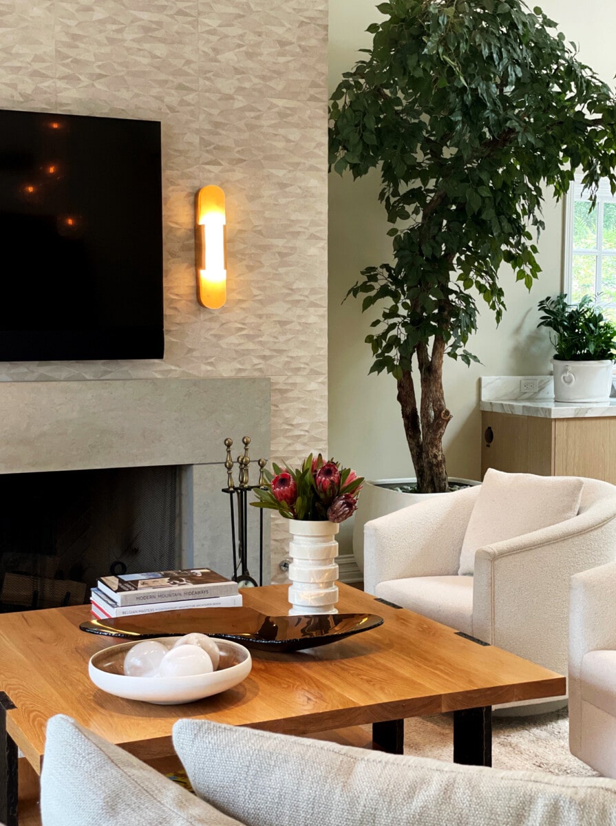
Courtesy of Stegall Studios
2. The palette is highly versatile, inviting personalization
“In today’s fast-paced world, people are seeking spaces that promote relaxation and well-being. These colors create a serene and calming atmosphere, which is highly desirable in modern living,” suggests Acacia + Spruce.
“Creams, beiges, and taupes serve as a versatile backdrop, allowing homeowners to easily incorporate various decor styles and color accents, making it adaptable to changing preferences. Despite their neutrality, these hues can be personalized with textures, patterns, and pops of color, giving homeowners the freedom to express their individuality while maintaining a cohesive look.”
3. Incorporate texture into the mix
“My best design tip is to incorporate layered textures into a neutral home design,” recommends The Best Nest. “This prevents the space from feeling flat and creates interest. Varying tones of beiges, tans, and creams gives a warm, relaxing energy and creates a perfect backdrop for thoughtful pops of color in wall art, lamps, and pillows. Adding in natural organic elements like wood, plants, and stone will really take this design to the next level.
Bonus tip: use the ceiling to infuse warmth and a bit of drama into your space. Have tall ceilings? Paint them a darker tone than the walls or add wood beams or textured wallpaper.”
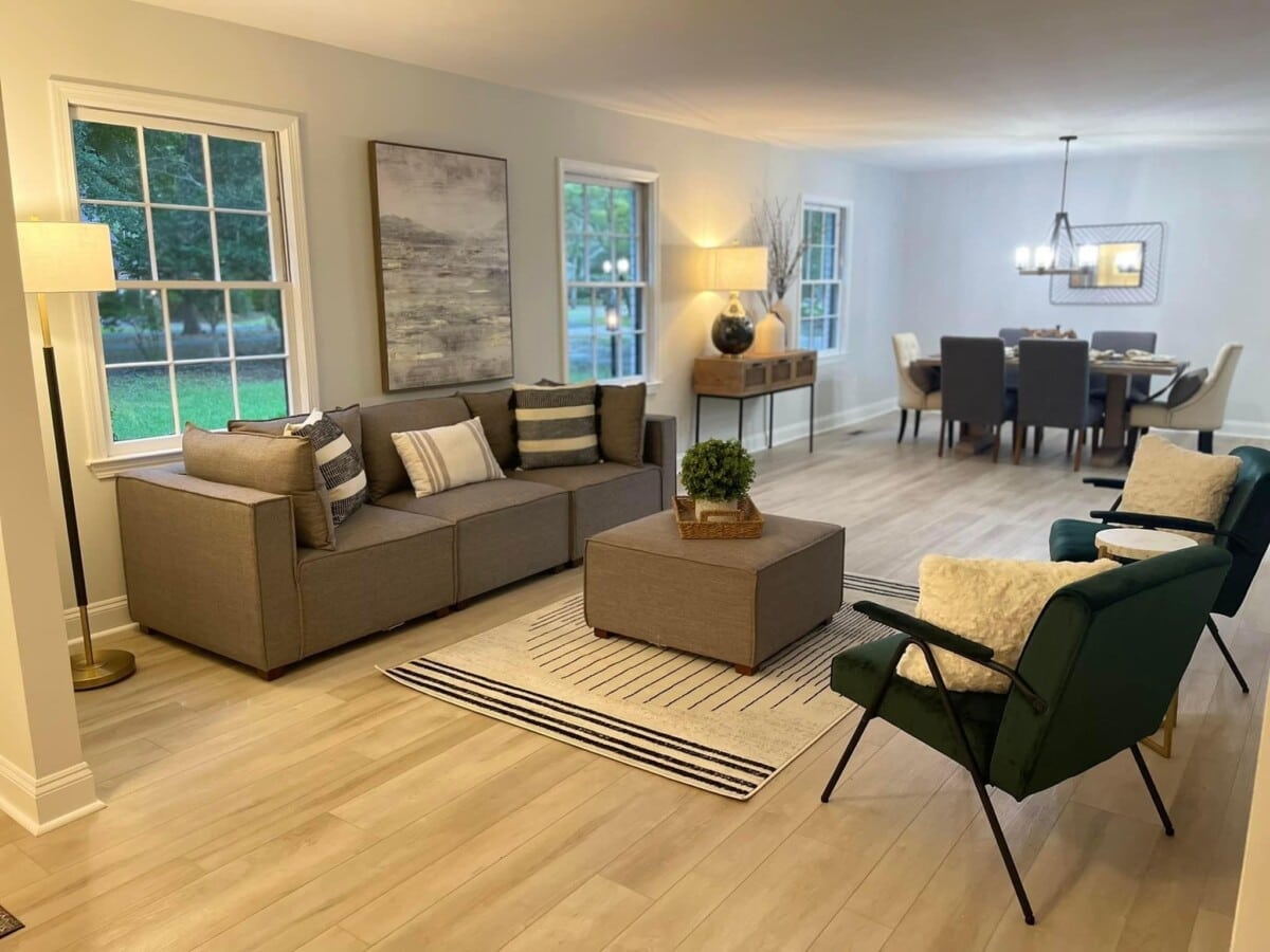
Courtesy of The Best Nest
4. Be purposeful when laying colors, patterns, and texture
K.C. Customs, Inc. recommends that “When working with this color palette, we recommend you pay meticulous attention to texture, layering plush fabrics, rich woods, and subtle patterns to achieve depth and visual interest. Thoughtful lighting plays a crucial role in accentuating the inviting ambiance of these hues. These colors not only stand the test of time but also adapt seamlessly to diverse design styles, making them a versatile choice for every homeowner’s vision.”
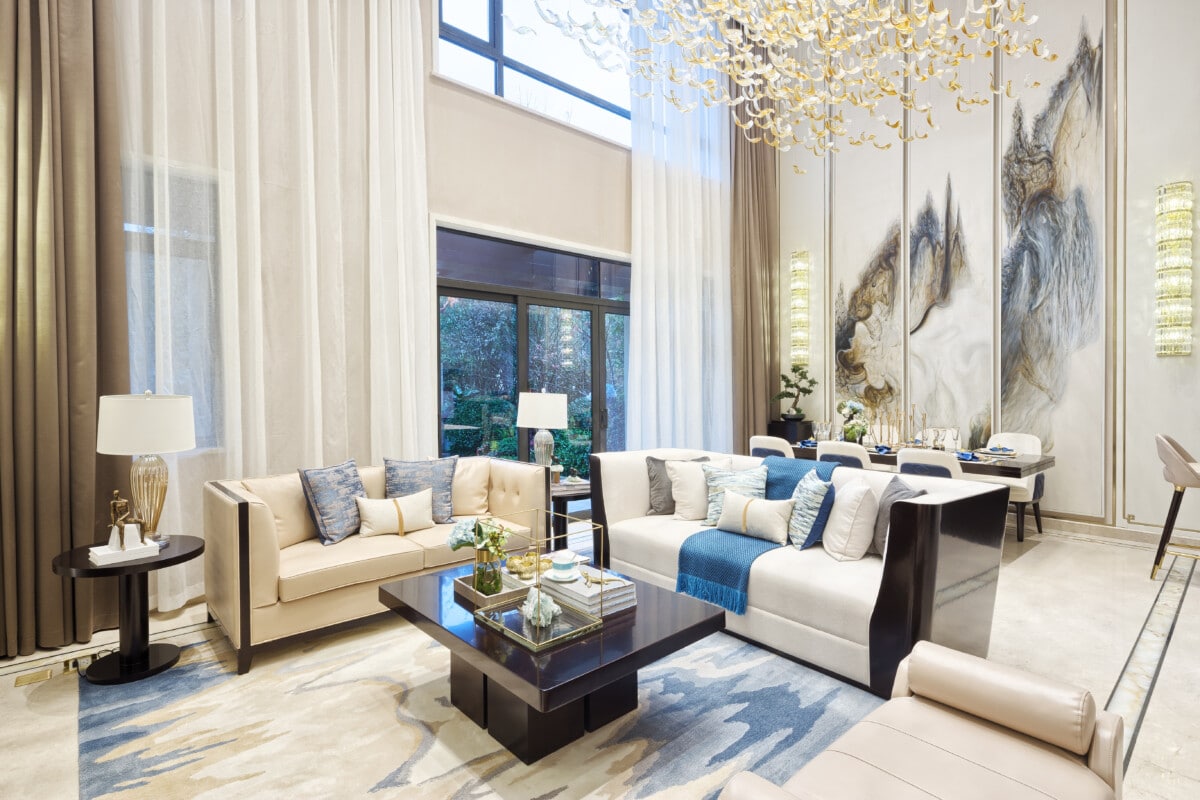
Courtesy of K.C. Customs, Inc.
5. Warm colors are in
“Designing homes with creams, beiges, and taupes is a design trend that is gaining fast traction as grays slowly fade,” shares Brandie Crain Interior Design. “Whereas grays can leave a space feeling cold if left to their own devices, softer forms of brown bring warmth to a room and feel classic, but still fresh. Wood tones and natural, woven accents pair well with these colors—combined, they create a sense of warmth and comfort. The palette can be styled with black or gold accents to give it a more modern touch or whites and medium to dark grays to give it a more old-world feel with deeper contrast.
These colors can be used on walls, but I like to paint walls and trim the same warm white and use taupes and darker beiges on anchoring pieces like couches and cabinetry and lighter beiges and creams for accessories, but avoid dark browns and beiges and creams with too much yellow, which tend to look outdated.”
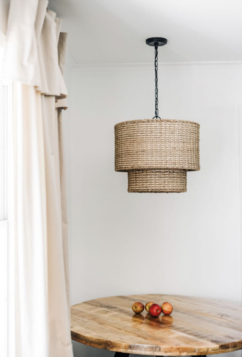
Courtesy of Brandie Crain Interior Design
6. Millennial gray is out
“Recently, the resurgence of creamy tones is replacing the bright white, high contrast trend that ruled nearly every sector of home design for many years,” notes Courtney Brown. “A natural, creamy color palette subtly softens your home with lived-in warmth and a calming atmosphere.
The key to pulling off this tone-on-tone design? Layering. Through layering a variety of textures, neutral accents and organic materials, a palette of creams, beiges, and taupes is both timeless and fresh. When used as your home’s foundation, it creates a seamless flow from one space to the next, allowing an elevated and elegant bedroom and a relaxed, cozy living room to organically co-exist.”
7. Use natural, dark pops of color like wood
“The warm natural palette has become a trend because it’s really fool proof,” insists AESTHETIK Design by Victoria Tik. “I love adding dark pops for contrast and using white oaks when it comes to woods and or flooring to really bring the look home. This look stands out because it’s timeless and so adaptable, you can go from ultra modern to victorian or bohemian using this same palette.
To keep this look unique style, folks should feel free to incorporate their own personal touches with souvenirs from their travels or little pops of dark to balance things out. Have fun with it, don’t take design too seriously or it won’t be fun. And at the end of the day, we all just want to create a beautiful space that’s truly livable.”
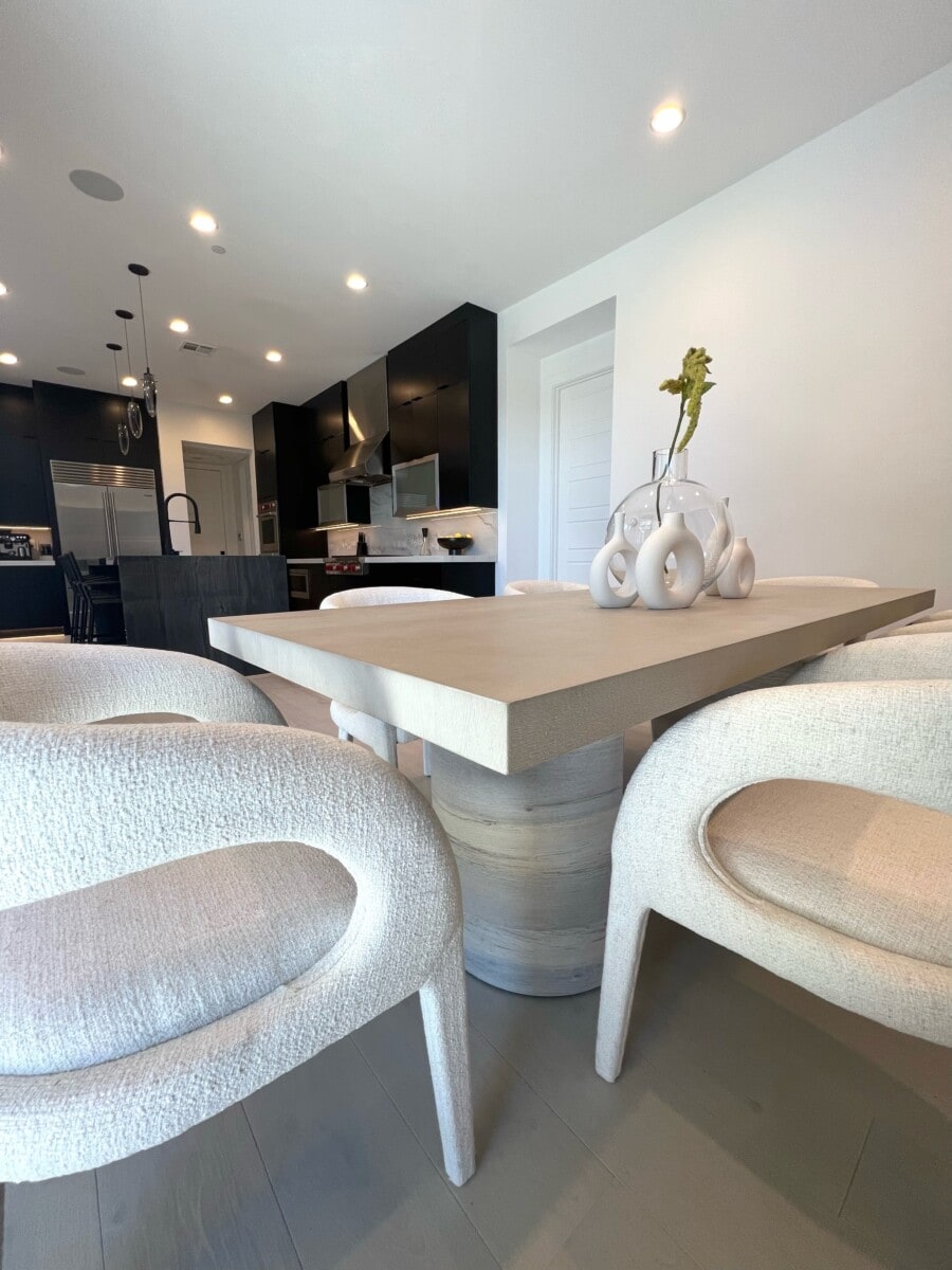
Courtesy of AESTHETIK Design by Victoria Tik
8. Add pops of color with plants and accessories
“Use different shades of the same color to create depth and interest,” suggests Youth Design Philly. “Add plants and flowers to add life and color to the space. Add pops of color through natural materials like wood, stone, and leather to add warmth and texture. Take advantage of natural light whenever possible. Keep the furniture simple and uncluttered. Add a personal touch and fun to the space with accessories, artwork, or plants.”
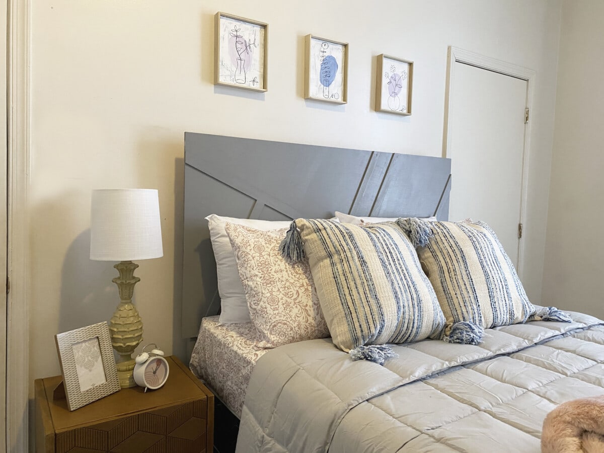
Courtesy of Youth Design Philly
9. Make models before committing to a design
“Make sure when looking at finishes you know where it’s going,” recommends JL Interiors. “Lighting in a space is very important to create harmonious design. If you have a wall tile and a floor tile, look at them in different spaces. Make sure your wall tile is perfectly leaned upwards on a wall, and your floor tile is laid flat on the ground, so you know what they will look like in the end.
Paint is extremely important, make sure to not pick only one color from a color deck. Paint up multiple samples on the wall where the wall doesn’t get light, then you will understand which sample works best with your design.”
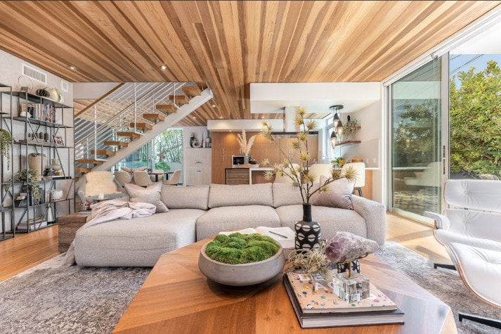
Courtesy of JL Interiors
10. Mixing elements creates visual impact
“The incorporation of woven baskets and handcrafted ceramics can add interest and texture to the neutral palette,” suggests Studio Squire. “Additionally, the inclusion of plants such as succulents and air plants can effectively connect the room to nature while imparting a sense of warmth and comfort. Incorporating plants into a neutral design can elevate its visual impact to its fullest potential.
The infusion of mixed metals, such as brass and oil-rubbed bronze, can further enhance the palette by imbuing it with a sense of warmth and grounding, thereby elevating its overall aesthetic appeal. The strategic use of black and dark, warm grays can lend a touch of sophistication to the neutral palette.”
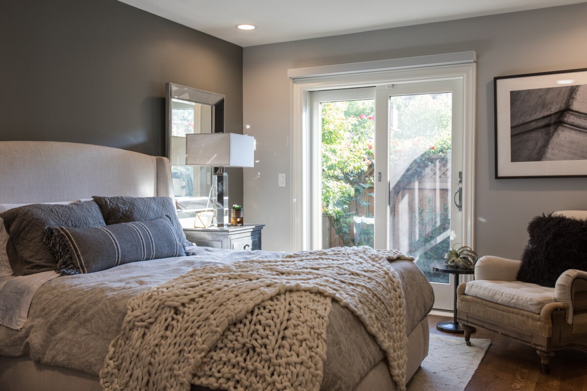
Courtesy of Studio Squire
11. Neutral home decor is a timeless classic
“A successful interior is like a well-dressed person. They know well that creams, beiges, and taupes are timeless classics,” shares School of Sketching by Olga Sorokina. “They’re unlikely to combine a striped jacket with a checkered shirt, and if they do, they’ll do it tastefully, because knowing the rules allows you to break them.”
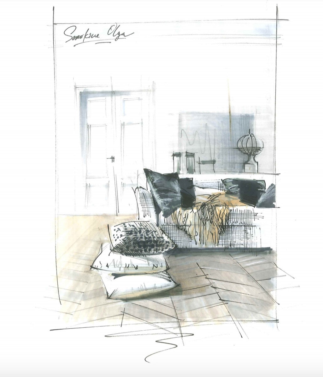
Courtesy of School of Sketching by Olga Sorokina
The post Embracing New Neutrals: Creams, Beiges, and Taupes for a Welcoming Home appeared first on Redfin | Real Estate Tips for Home Buying, Selling & More.
from Redfin | Real Estate Tips for Home Buying, Selling & More https://ift.tt/HjLoRNW


No comments:
Post a Comment